The Premium Layout in Excel
Adjust Charts
To simplify the transfer of chart from Excel to Word, there is the "Adjust chart width" function. Using this function, it is possible to adapt charts to the table widths or type area in your Word document in Excel. This saves you work when finalising your Word document later. At the touch of a button, you select the appropriate width.
If you are unsure which chart width you should select, you have two possible orientation options:
- You can display which type area your document has in the Layout functions.
- You can check in Table assistant in Word which width you have selected here for tables.
To adjust the width of a chart, proceed as follows:
-
Click on the chart you want to adjust.
-
Click on the " Adjust chart width" button in the "Graphics" group on the "*Premium Layout" tab.
→ A dialogue opens in which you can choose between different settings for the chart. /li> -
Click on the settings you want for your chart.
→ The selected settings are applied to the graphic. The chart settings are applied when transferring from Excel to Word.
Chart templates
firesys provides you with a range of chart templates that you can insert at the touch of a button. You have the choice between
- Column chart (This chart type allows you to visually compare values between categories).
- Line chart (With this chart type, you can display trends over a period of time (years, months or days) or for categories).
- Bar chart (This chart type allows you to visually compare values between categories).
- Pie chart (With this chart type, you can display proportions of a whole. This chart type can be used when the sum of the values is 100%).
- Combo Chart (Use this chart type to highlight different types of information. Use it when the range of values in the chart veries widely or you have mixed types of data)
- Scatter Chart (Use this chart type to show the relationship between sets of values)
To insert one of the templates, proceed as follows:
-
In your table, select the data you want to display.
-
Click on the "Columns"/"Bars"/"Lines"/"Pie" button in the "Graphics" group on the "*Premium Layout" ribbon.
→ The chart is inserted.
 Conditional formatting
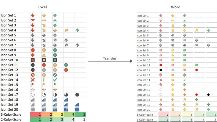
Find trends and patterns in your data easily with the aid of bars. Colours and symbols visually highlight important values. The conditional formatting can be transferred to Word.
Good to know
| |
|---|---|
firesys supports the Format Styles "2-Color Scale", "3-Color Scale" and "Icon Sets". The "Data Bar" format style is not supported by firesys. |
The transfer of the background and font colours of an Excel cell is available to you in all firesys documents. The relevant option must be activated in Word for the transfer. In the firesys layout, you can also integrate icon sets in tables.
Video: Application of a colour scale
To assign a colored conditional formatting to table cells:
-
Open the worksheet in Excel and select the cells to which you want to apply conditional formatting.
-
Click on the "Conditional Formatting" button in the "*Premium Layout" ribbon.
-
Select the "Color Scales" submenu from the drop-down menu - and select the desired color scale.
→ The selected cells are now highlighted, depending on the selected formatting scale.
Video: Display of arrow symbols
To assign a colored conditional formatting to table cells:
-
Open the worksheet in Excel and select the cells to which you want to apply conditional formatting.
-
Click on the "Conditional Formatting" button in the "Design" ribbon.
-
Select the "Directions" submenu from the drop-down menu - and select the desired arrow constellation.
→ The selected cells are now provided with colored arrows, depending on the selected formatting direction. -
Switch to the Word document in which the linked table was included.
-
Open the firesys settings and check that the function "Set highlighting" is selected in the group "Table layout and structure" in the tab "Data from Excel".
-
Select the desired table - and execute the function "Update selected object" in the menu band "Contents" in the group "Excel data".
→ The table is now updated and the corresponding conditional formatting with is applied to the table.
Video: The use of conditional formatting with font adaptations
To assign a colored conditional formatting to table cells:
-
Open the worksheet in Excel and select the cells to which you want to apply conditional formatting.
-
Click on the "Conditional Formatting" button in the "Design" ribbon.
-
Select the "Cell highlighting rules" submenu from the drop-down menu - and select the desired criterion.
→ A dialog opens where you can specify the behavior of the conditional formatting more precisely. -
Select the "custom format" option in the right-hand selection dialog.
-
In the dialog that now opens, select the desired font to be used when the conditional formatting is displayed.
-
Save the Excel document and switch to Word.
-
Make sure that the setting "Font color" is activated in the group "Data from Excel" in the submenu "Table design and structure" in the firesys settings.
-
Execute the "Update" function in the "Excel Data" group in the "*Contents" menu band.
→ The table is updated and the conditional formatting is applied to the table. .
See also
![]() The Premiumlayout in Word
The Premiumlayout in Word
![]() Overview of the layout manager
Overview of the layout manager
![]() Update Premium Layout
Update Premium Layout

