Edit diagrams: Unterschied zwischen den Versionen
Keine Bearbeitungszusammenfassung |
Keine Bearbeitungszusammenfassung |
||
| (10 dazwischenliegende Versionen von 2 Benutzern werden nicht angezeigt) | |||
| Zeile 1: | Zeile 1: | ||
__NOTOC__ | |||
Adapt diagrams to your corporate design. You have the possibility to design your diagrams individually. These include, among other things, axis and Data captions as well as the colouring of the individual diagram elements. | |||
== Functions== | |||
In order to take advantage of the Layout manager when designing graphics, you need to consider a few points when creating graphics in Excel. <br> | |||
The Layout manager accesses a specific colour palette in Excel and converts these colours into the colours you selected in the Layout manager in Word. The advantage is that you do not have to worry about the layout in Excel. | |||
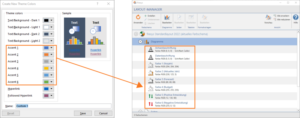
If you initially create a graphic in Excel, Excel will automatically use the colour palette accessed by the Layout manager. When transferring to Word, the accents 1 - 6 in Excel are replaced with the colours 1 - 6 in the Layout manager. Your graphic will therefore probably have different colours in Excel than later in Word. | |||
If you want your graphics and diagrams to be displayed in Excel in the same way as they will be converted later in Word, you must adapt the selected colours in the Layout manager to the accents in Excel. You have two options: | |||
* You can adjust the accents in Excel to align them with the Layout manager | |||
*You can adapt the colours in the Layout manager to the selected colours in Excel | |||
== | [[Datei:EN Layout-Manager Diagramme Farben.png|1200px|center]] | ||
==Adapt diagrams== | |||
[[Datei:EN Word Screenshots firesys-Layout Layout-Manager Diagramme bearbeiten.jpg|500px|right]] | [[Datei:EN Word Screenshots firesys-Layout Layout-Manager Diagramme bearbeiten.jpg|500px|right]] | ||
You can customise your charts with the following parameters. | |||
<b>Axis and data caption</b> <br> | |||
Here, both font colour and font type can be adapted to your individual wishes. | |||
<b>Colour of the individual data types</b> <br> | |||
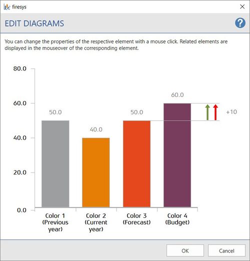
Select a colour for the individual data types (previous year, current year, forecast, budget, positive/negative development are only suggestions and do not have to match your graphic). You can define colours for a total of six data types. | |||
Related elements are displayed in the “Edit Diagrams” dialogue when you hold the mouse pointer over the corresponding element. Clicking on the respective element opens an editing dialogue where you can choose between a variety of colours. When selecting colours, you have the option of either defining a custom colour using RGB values or selecting a colour from the Office colour palette. | |||
In the Layout manager, click on the arrow symbol next to Diagram to display all diagram elements in the list. If you select one of the list elements and then click on Edit, the position of the corresponding element is marked by a red arrow. | |||
<br> | |||
<br> | |||
<br> | |||
< | <br> | ||
<br> | |||
<br> | |||
< | <br> | ||
<br> | |||
<br> | |||
<br> | |||
<br> | |||
<br> | |||
==Video: Edit diagrams == | |||
{{Vorlage:Video-firesys-Layout-Diagramme bearbeiten-English}} | |||
< | === Adjusting accents in Excel === | ||
To match the accents (=colours) in Excel to the colours in the Layout manager, proceed as follows: | |||
<ol> | |||
<li> <p align="left"> Click on "Colours" in the "Page layout" tab in the "Design" group. <br> → A drop-down menu opens, displaying various colour options.</li> | |||
<li> <p align="left"> Click on "Customise colours". <br> → The window "Create new design colours" opens./li> | |||
<li> <p align="left"> Adjust the accents 1 - 6. The Layout manager accesses these when converting the colours. </li> | |||
<li> <p align="left"> Assign a name.</li> | |||
<li> <p align="left"> Click on "Save".<br> → The colours you choose are automatically applied to your chart in Excel. If the accents 1 - 6 correspond to the selected colours 1 - 6 in the Layout manager, the colours of the chart in Excel will correspond to those in Word. </li> | |||
</ol> | |||
== See also == | |||
< | [[Datei:Navigation_hoch.svg|link=]] [[Overview_of_the_Premium Layout|Overview of the Premium Layout]] <br> | ||
[[Datei:Navigation_rechts.svg|link=]] [[Other_functions|Other functions]] <br> | |||
[[Datei:Navigation_rechts.svg|link=]] [[Edit_texts|Edit texts]] <br> | |||
[[Datei:Navigation_rechts.svg|link=]] [[Edit_tables|Edit tables]] <br> | |||
{{MoreContent}} | |||
[[Kategorie: Edit diagrams]] | |||
Aktuelle Version vom 5. Juli 2023, 14:47 Uhr
Adapt diagrams to your corporate design. You have the possibility to design your diagrams individually. These include, among other things, axis and Data captions as well as the colouring of the individual diagram elements.
Functions
In order to take advantage of the Layout manager when designing graphics, you need to consider a few points when creating graphics in Excel.
The Layout manager accesses a specific colour palette in Excel and converts these colours into the colours you selected in the Layout manager in Word. The advantage is that you do not have to worry about the layout in Excel.
If you initially create a graphic in Excel, Excel will automatically use the colour palette accessed by the Layout manager. When transferring to Word, the accents 1 - 6 in Excel are replaced with the colours 1 - 6 in the Layout manager. Your graphic will therefore probably have different colours in Excel than later in Word.
If you want your graphics and diagrams to be displayed in Excel in the same way as they will be converted later in Word, you must adapt the selected colours in the Layout manager to the accents in Excel. You have two options:
- You can adjust the accents in Excel to align them with the Layout manager
- You can adapt the colours in the Layout manager to the selected colours in Excel
Adapt diagrams
You can customise your charts with the following parameters.
Axis and data caption
Here, both font colour and font type can be adapted to your individual wishes.
Colour of the individual data types
Select a colour for the individual data types (previous year, current year, forecast, budget, positive/negative development are only suggestions and do not have to match your graphic). You can define colours for a total of six data types.
Related elements are displayed in the “Edit Diagrams” dialogue when you hold the mouse pointer over the corresponding element. Clicking on the respective element opens an editing dialogue where you can choose between a variety of colours. When selecting colours, you have the option of either defining a custom colour using RGB values or selecting a colour from the Office colour palette.
In the Layout manager, click on the arrow symbol next to Diagram to display all diagram elements in the list. If you select one of the list elements and then click on Edit, the position of the corresponding element is marked by a red arrow.
Video: Edit diagrams
This is how you design your diagrams in the corporate design:
-
Click on the “Layout manager“ button in the “*Premium Layout” tab in the “Premium Layout” group.
→ The Layout manager opens. -
In the Layout manager, select the colour scheme you want to adjust and click on the arrow symbol on the left.
-
Click on “Diagrams” underneath.
→ In the group “Diagrams” the “Edit” button is now selectable. -
Click on the “Edit” button.
→ The editing window opens. -
Select the elements you want to adjust.
-
The following things can be changed individually:
-
Font and colour of the axis labelling
-
Font and colour of the data caption
-
Colour of the individual data types (previous year, current year, forecast, budget)
-
Colour of the individual arrows (Positive development and Negative development)
Note: you can set custom colours via the RGB values as well as select them via the Office colour palette. Switch between these two options with the “User-defined colour” button in the lower left corner.
-
-
Click on "OK" to confirm your settings.
→ The settings made are transferred to the Layout manager. To apply the changes to the document, the layout must be applied (see Apply Colour scheme).
Adjusting accents in Excel
To match the accents (=colours) in Excel to the colours in the Layout manager, proceed as follows:
-
Click on "Colours" in the "Page layout" tab in the "Design" group.
→ A drop-down menu opens, displaying various colour options. -
Click on "Customise colours".
→ The window "Create new design colours" opens./li> -
Adjust the accents 1 - 6. The Layout manager accesses these when converting the colours.
-
Assign a name.
-
Click on "Save".
→ The colours you choose are automatically applied to your chart in Excel. If the accents 1 - 6 correspond to the selected colours 1 - 6 in the Layout manager, the colours of the chart in Excel will correspond to those in Word.
See also
![]() Overview of the Premium Layout
Overview of the Premium Layout
![]() Other functions
Other functions
![]() Edit texts
Edit texts
![]() Edit tables
Edit tables

